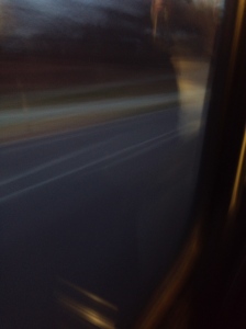
Want to take a slow shutter photos but do not have a DSLR? Try SlowShutter. SlowShutter is a great app for iPhone users who wants to take cool blurred pictures, and it is featured by Apple in “App Store Essentials: Camera and Photography”.
In the app, it has 6 shutter speeds that you can choose from and also a B shutter that can let you shot as long as you want.
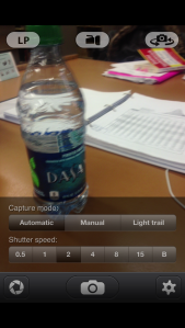 Besides that you can also change the capture mode: automatic, manual, and light trail. In the automatic mode, the camera controls the amount of light that the aperture captures; in the manual mode, the light will accumulate until you finish the shot; in the light trail mode, you can chose the sensitivity of your camera to the light. It also has a live preview function that is really useful when talking photos (that appears to be LP in the shooting page). You can see both the outcome of the photo while still seeing the scene that you are taking. This makes it easier for users to get a sense of what is happening in the frame.
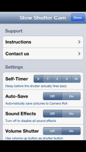
For the visual elements, I think SlowShutter did a good job that most of its icons and functions can be well understood and easy seen. However, the flash icon is one of the two flaws in this app. Because I don’t think it looks like a flashlight. The icon appeared to be more like a video recorder when I first opened it. The second flaw is the app seriously needs to be updated to support iPhone 5. From example, it looks kind of awkward of having some black spaces above and below when taking a shot.
Overall, I think SlowShutter is an easy and useful camera app that people can use to take beautiful slow shutter speed pictures.
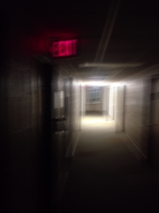
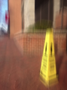
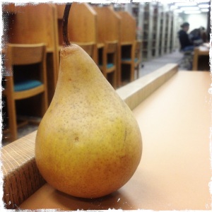
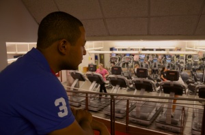
These are photos that I took:


The other app that I downloaded is Hipstamatic. This is another camera app that is recommended by Apple in its “Camera and Photography” section. The main function that this app does is a postproduction and flash control. In other words, it is an Instagram app that you can control your flashlight that makes cool effects.
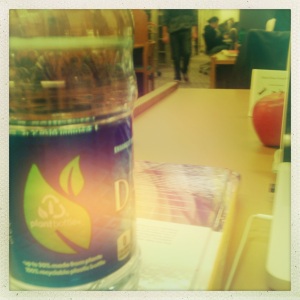
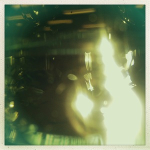
What makes this app unique is that you can play with different combinations of lens, films, and flashlight that it provides in store. There are around twenty different features that you can buy in store to play with. These are some cool features that I used to take photos.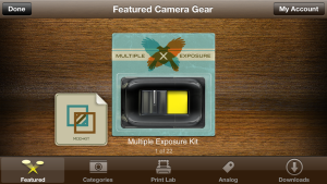
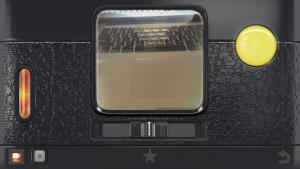
It is also really impressive to have the old camera interface as the menu of the app (and also the icon of the app). It makes you feel like taking a picture in old cameras: you can look through the small square glass to take your picture. It also makes the dusty effect when you see the image trough the “glass”. These give the user a great visual effect of using your phone as old cameras and you can also purchase other interfaces that you like in store. When you view the photos that you took in the photo gallery, it actually gives the information of what lens, film, flash that you use.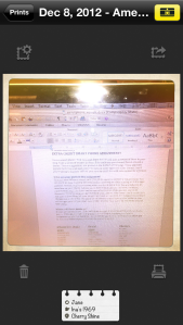 It is really useful if you want to take a picture with the same effect. Another thing that is good about this app is that they give you pictures of how they look in the real world when you want to choose different lens, films and flashes.
 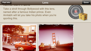 They also give you photo examples when viewing them, which can give one a great visual idea before choosing the lens, films and flashes. However, the only
bad about this app is if you want to use more “lens” or flashlight effects, you have to buy it from their store. Besides that, you can set up your favorite camera combination. This function is really useful when you feel tired of
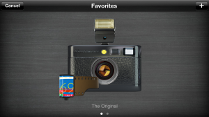
changing the flash, film, and lens one by one. They also provide the user a visual image for the whole combination, which I think, is really cool.
However, the set up for this app is kind of difficult. When I first use this app, I was confused by the buttons and visual elements they have. I also have a problem switching the lens and films that it has (I do not know that the back icon that it had in the bottom right corner can lead you to the other side and switch the features). I think it is a better idea to give some tutorials or at least some explanations for first time users.
To sum, this is a great app to have that you can shoot cool combination that you discover. Despite the flaws that I talked about, I would really love this app when I am tired of the multiple steps of postproduction.
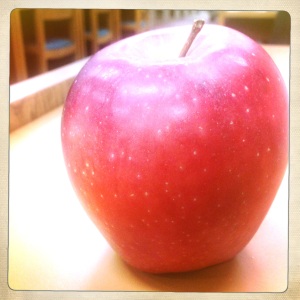
These are photos that I took:

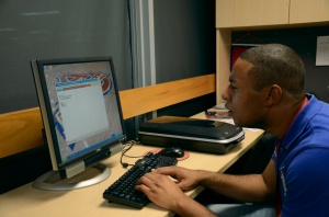
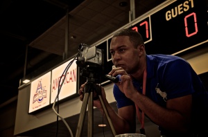
 Overall, I enjoyed the experience with Malcolm working for the AU Athletics. However, this is not an easy job. You have to take photos/ videos and also do post production and only get paid for $10/ hr. But I think it is fine as long as he enjoy his work. I hope I can see him some day when I watch AU athletics matching with other teams!


